So, since I know a couple of things about taking photos...I thought I'd share a few tips. These are things you can do to improve your photos even while shooting on a full auto mode. You'll be amazed what a difference it will make.
1. Ignore the background...Look at the Light!
This is the biggest! You know you've done it, there is a beautiful background...maybe full of blooming tulips. You position your kiddo's right in front of it. Maybe it will look great. But what if it's 1 PM, and the sun is high. Ya think?? If you were shooting on manual...I could tell you how to make this work better. But let's do this the easy way...take your subjects out of the sun and put them in the shade.
The best kind of shade is where some light is getting in to pick up some catch lights in their eyes. But look at your subjects face. Are they squinting? Are there shadows all over their face? Not Good!! Find some nice even shaded light and snap away. Even if the background isn't ideal...your images will be so much better! Promise.
The image below I put them in the shade that this building created, and the light was even and flattering.
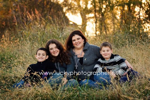
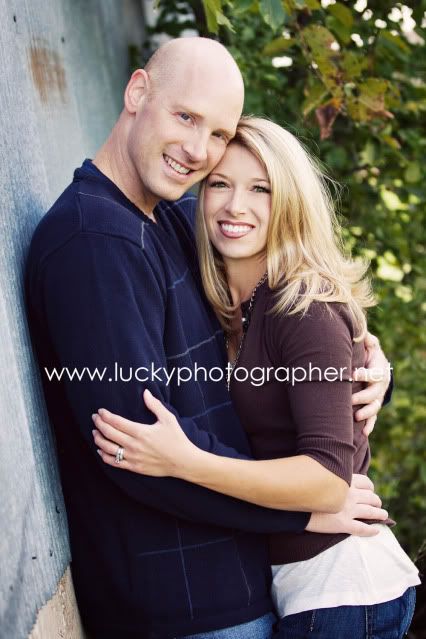
*If you must take it in front of something, like your on vaca and want your subject in front of a particular landmark etc...and the sun is high and unflattering, try using your flash to fill your subjects face.
2. Fill the Frame
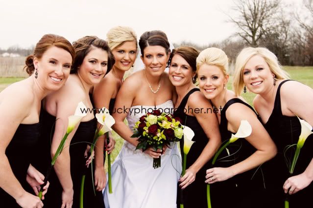
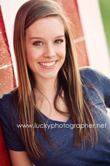
Especially if getting in the right light causes you to have an unflattering background. Is the perfect light in front of a trash dump? It could be cool...but maybe not. So fill your frame with your subject.

3. Rule of Thirds
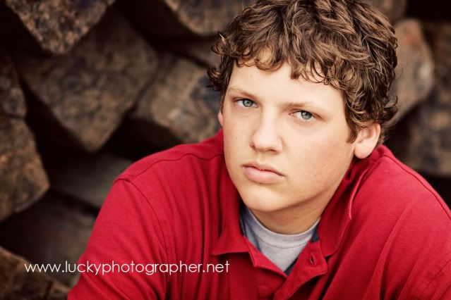
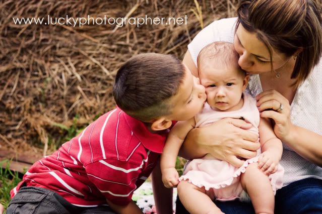
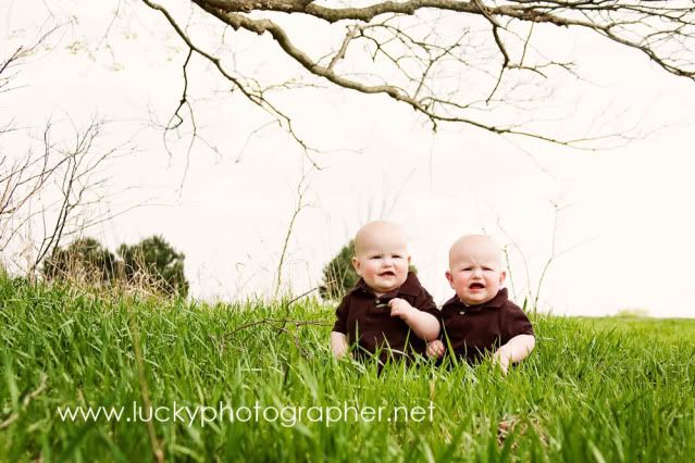
If you've ever taken an art class, you will have heard this term. It is a compositionall rule that applies to all mediums of art— Photograpy, painting, drawing. It is more pleasing to the eye and it can make a good image great. It involves breaking the scene into 9 equal parts and positioning your subject where lines intersect. So, there are 4 sections you can use. This isn't rocket science...it doesn't have to be exact!! (See the chart below.) But look at the 3 examples...if they would have been centered they wouldn't be as good. This rule also is in place to try to avoid the horizon being in the center of an image. It needs to be in the upper part or the lower part. Never in the center.
If you start looking for it, you will find the rules of thirds everywhere. Advertisements, movies, tv, photography.
With technology these days, there is no excuse for not getting the best picture possible...you can try and try again. I'd love to hear if these helped anyone...I hope so!!


